GRAN MELIA PALAZZO CORDUSIO
Published by Sugar & Cream, Wednesday 10 January 2024
Images courtesy of Studio Marco Piva
Preserve the Past by Designing the Future
The historic Palazzo Venezia, a building erected at the end of the 19th century based on a design by architect Luca Beltrami, formerly the headquarters of Generali Assicurazioni, reopened its doors.
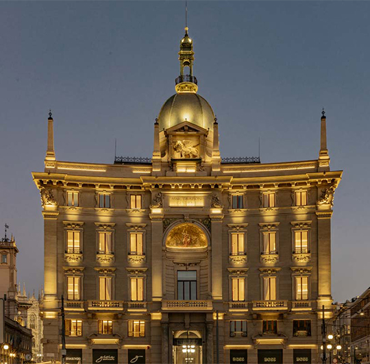
Redeveloped and partly converted for hotel use, the new Gran Meliá Palazzo Cordusio represents the intersection of History and Hospitality, a tangible homage to the synergy between the preservation of collective memory, historical heritage and the desire to create new experiences shaped by the present.
Studio Marco Piva, which won the architectural competition, was responsible for the Artistic Direction of the areas subject to monument protection (management of relations with the Superintendency of Milan, the institutions and the other partners involved in the project for all protected spaces), of building and permitting procedures, distribution plan of the interior architecture and terraces, and construction of the central courtyard.
The goal of the Palazzo Venezia redevelopment project and of the conversion of part of its spaces into a hotel was to give new artistic and civic value to the building: the renovation started with a dialogue with the past and saw a close collaboration among all involved designers and bodies who, as guardians of a priceless heritage, succeeded in creating a future that respects its roots.
Gran Meliá Palazzo Cordusio: in the Studio Marco Piva project, the walls of the past merge seamlessly with the contemporary era, offering an experience that embraces yesterday, today, and tomorrow, providing the city and its citizens and/or visitors with a new urban social space.
THE PROJECT
The façade, entrance, terraces and lighting
The redevelopment of the Palazzo Venezia façade by Studio Marco Piva focused on the preservation and restoration of the historical and cultural value of the building. Together with the restorer and the Superintendency, it was agreed that the type of project to be carried out should align with the methodological foundations of conservative restoration, in order to maintain the architectural, artistic and historical characteristics of the building, avoiding irreversible changes.
The restoration sought to restore the historicity of the entire building envelope, starting from the external façades and moving on to the windows and doors (all fixtures were replaced with high-performance wooden frames faithfully reproducing the finish and geometry of the original ones from 1900) and to the roof coverings, with operations aimed at reducing the deterioration of existing surfaces and, where that was not possible, at introducing new surfaces and materials that were aesthetically and technologically compatible with the existing ones.
Presented by Zipblind
The intervention also involved the preservation of the historic entrance door, now the main hotel entrance, through the creation of a second glass door with filtering function, where a first hall with all reception functions is located.
The Artistic Direction project of Studio Marco Piva included the decision to standardize the signs of the brand shops on the ground floor with the objective of reinforcing the image of the building and creating a unique, scenic visual consistency in its entire perimeter: an elegant measure aimed at highlighting, first and foremost, the building and its monumentality. The Studio selected the floor finishes for all the terraces together with the Superintendency, with the goal of conforming to the typical Milanese wooden terraces.
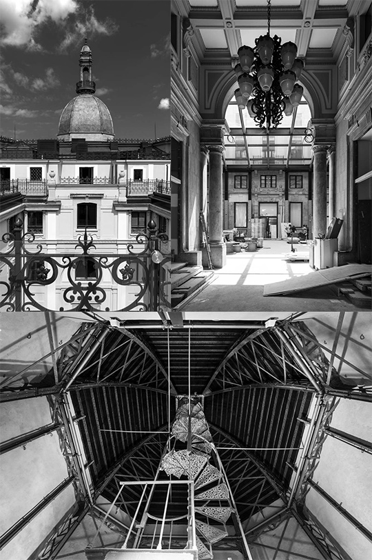
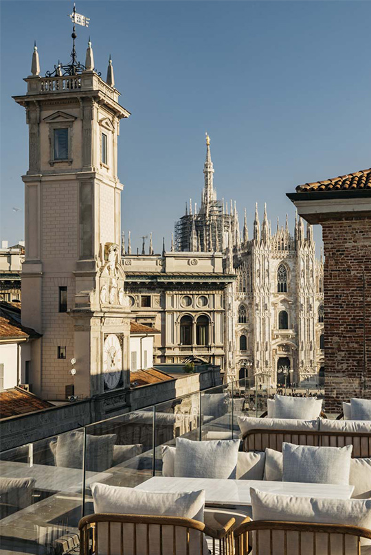
The project also involved raising the terrace on the fifth floor overlooking Piazza Mercanti and the Duomo in order to obtain the best possible view from what will be the hotel bar. The existing parapets were cleaned, restored and reinforced, with the addition of protection glass elements to ensure compliance with current regulations.
On the fifth floor, visible from Piazza dei Mercanti, a pergola was also created, designed in collaboration with the Superintendency: an architectural structure featuring stainless steel wires for the placement of climbing plants, to offer the typical green effect of Milanese terraces, even from street level.
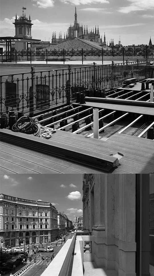
On the fourth floor, where the attic used to be, an additional convivial area was created, a terrace with a view over the Duomo, which will host a further F&B area.
The technical lighting project, carried out with industry specialists and following the guidelines of the Superintendency, was aimed at enhancing the historical and architectural characteristics of the Palazzo and its privileged position in the context of Piazza Cordusio. Plays of light, all LED, emphasize and enhance the central entrance of the new hotel, its two sides, the via Mercanti corner and via Orefici corner, both intended for commercial use, and the copper surfaces of the Dome and its lantern.
With over 400 light sources over the entire building (around a hundred on Piazza Cordusio), in addition to the daily sunset choreography, a series of light scenes have been designed to create evocative night scenarios in celebration or commemoration of different events, from the Italian flag to International Holocaust Remembrance Day and Father’s and Mother’s Day. The entire system is dimmable and programmable through an intuitive digital interface.
With the same technology, programmable RGMW bars have been installed inside, in the glass rooftop and on the internal cornice. These light elements can be programmed to mimic what happens outside or to work independently.
Interior architecture
The interior architecture and space distribution, including the creation of 84 rooms (the original plan was for 70) and common areas, were designed by Studio Marco Piva, which preserved the structural parts of the building and its protected elements through recovery interventions, adapting internal areas to accommodate new functions.
The general refunctionalization of the building from office to hospitality use involved a major overhaul of the internal distribution. In addition to the numerous structural and system interventions, such as replacing all existing lifts and adding new elevator bodies, the new architectural function involved making many openings, even in load-bearing walls, thereby allowing an efficient internal distribution of corridors to guest rooms on all the floors, from the first to the fourth.
Another challenge was to connect the main body of Palazzo Venezia with the more recent intervention of Palazzo Cassi-Ramelli in Via Mercanti: the two palaces were not originally designed to work in synergy and therefore had, in addition to different styles and compositional characteristics, a different number of floors which, in the plan, allowed part of the hotel function to be transferred to the adjacent Palace.
On the intermediate floors, there are some common areas that can be used by guests, including three Meeting & Conference Rooms on the second floor and a Gym on the third floor, accessible through a glass door and featuring large mirrors and a series of windows that multiply this space overlooking Piazza Mercanti.
On the fifth floor, the architecture of the restaurant and bar areas is unique, as they were created in the spacious attics of the penthouse, which occupy the two wings at the base of the dome: the areas have been designed with a slope that follows the natural inclination of the existing pitched roof, and they also include a private dining area connected to the main restaurant. In addition, both the Bar and the Restaurant have portions of interconnected outdoor terraces, allowing for smooth transition from one space to the other.
A SPA & Wellness Area with its own reception has been created in the basement, originally used only to house technical rooms. The architectural project has made it possible to dig a pool in the centre of this space, located virtually below the central courtyard, and to create areas suitable for also installing a sauna, Turkish bath, emotional showers, ice waterfall and men’s and women’s changing rooms.
The monumental staircase
A significant conservation intervention was carried out on the internal staircase. The marbles were selected to match style of the original ones on the floors (Rosa Asiago) and on the coatings (Verdello). In line with a conservative approach, the marbles on the walls and floors were smoothed and continuity in the missing portions was restored with Labradorite marble, which was also used to make the thresholds and frames of the new openings.
On the second floor landing of the monumental staircase, the portal in Brown Antique bearing the words “Generali Assicurazioni” has been preserved to keep a reference to the building’s previous function.
For all the portals of the historic staircase and for the newly created ones, Studio Marco Piva used Labradorite, which has aesthetic characteristics similar to those of Brown Antique, in order to evoke the original preserved portal and then pursue a consistent language through its use in the building (Brown Antique, selected at the beginning of the project, was no longer available in its chosen finish by the time of construction, leading to the choice of Labradorite). Once cleaned and restored, the existing parapets were raised to comply with regulations, through an intervention that maintained continuity and preserved the original handrails.
The requirements for overcoming architectural barriers also necessitated the replacement of the existing lift (from 2007) with a new one that complies with current regulations. The new panoramic steel and glass lift fits precisely into the monumental staircase, with a structure that has also allowed the structural consolidation of the entire staircase.
The central courtyard
Certainly the most interesting part of the architectural project designed by Studio Marco Piva lies in the internal courtyard, an open space which was historically used for stabling horses and later became a parking lot for users of the building.
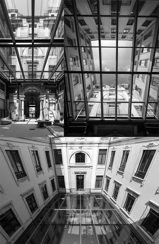
This area has now been returned to the city through the construction of a significant steel and glass structure at the height of the second floor balcony, where originally there was a change in the façade finish: a multifunctional space that can be managed according to needs, for events, meetings, conferences, as a breakfast hall, a lobby, etc.
The glass roof of the courtyard is supported by a series of steel structure pillars that make the roof completely independent of the building from a seismic point of view. The composition and structure of the primary and secondary beams follow the polygonal geometry of the architectural plan, resulting in a roof consisting of a series of unique very high-performance windows (selective triple glazing). This is a very complex intervention considering that all the glass panels, although symmetrical in appearance, are in reality all different from one another.
The replacement of the floor slab of the central courtyard, for structural reasons, has allowed the installation of an underfloor heating system, making the space thermally independent. Access to the courtyard is from the main entrance of the hotel or via the staircases and lifts. Additionally, disabled access has been provided on Via Orefici as well as two emergency exits on Via Orefici and on Via Mercanti. The ground floor windows facing the courtyard have been converted into display windows that can be set up independently by the management; this has made it possible to install and conceal all necessary building systems.
The Dome
The hotel reception has been located on the top floor, in the most significant architectural part of the building, the majestic dome, symbol of Piazza Cordusio. The area has been treated with great sensitivity and a keen eye by all the professionals involved. The flooring here and on the entire fifth floor is in Venetian Terrazzo, in keeping with the typical finishes used by Beltrami in his most characteristic works.
The design of this area was therefore based on the reduction of non-original elements in order to restore the space to its original conformation, favouring removals rather than additions.
The conservative restoration of the space has brought to light the original plasterwork as well as the metal structures that support the entire octagonal dome. The staircase leading to the lantern, a striking wrought iron structure with a helical geometry extending almost 10 meters in height, has been restored. The staircase makes it possible to reach the highest point of the building, which offers a unique 360 degree view.
All technical equipment aimed at providing the necessary comfort to the space has been installed with the same approach. Underfloor heating has been installed and the fire protection systems have been installed so as to blend with the existing structures. Finally, the interior lighting design aimed to enhance the wooden structures and surfaces throughout the entire span of the dome, with the goal of respecting and emphasizing the historical aspect.
PROJECT CREDITS
CLIENT
Generali Real Estate | Meliá Hotels International
BRAND
Gran Meliá
ARCHITECTURE, INTERIOR ARCHITECTURE, FACADE TECHNICAL LIGHTING AND RELATIONS WITH THE SUPERINTENDENCY
Studio Marco Piva
INTERIOR DESIGN
Asah
CONSERVATIVE RESTORATION
Gasparoli
SUPERINTENDENCY OF ARCHAEOLOGY, FINE ARTS AND LANDSCAPE FOR THE METROPOLITAN CITY OF MILAN
Architect Annamaria Terafina, Architect Valentina Minosi, Architect Paolo Savio
PROJECT MANAGER AND WORKS MANAGEMENT
Artelia
EXECUTIVE PROJECT ARCHITECTURE AND INTERIOR DESIGN, SYSTEMS AND STRUCTURES
Tekne
GENERAL CONTRACTOR
Percassi
MANAGEMENT CONSULTANT
CSA – Corrado Serafini Architetti
FIRE SAFETY
Studio Mistretta
PHOTOGRAPHS: Andrea Martiradonna
 104
06/04/2026
BACCARAT STAGES ITS FIRST ROADSHOW IN INDONESIA WITH ICONIC MUSEUM PIECES
Step into “Luxurious Lifestyle,” an immersive exhibition by Baccarat and Elite Grahacipta at The Langham Jakarta, April 8–11, 2026, presenting...
read more 128
06/04/2026
PLAZA INDONESIA VIP DAY 2026: SELEBARASI DAN APRESIASI LOYALITAS
Hadiri Plaza Indonesia VIP Day 2026 pada 9 April 2026 dan nikmati beragam aktivasi serta pengalaman imersif yang dirancang untuk memanjakan para...
read more 10.93K
27/03/2026
RITZWELL - PREVIEW SALONE DEL MOBILE.MILANO 2026
At Salone del Mobile.Milano 2026, Japanese furniture brand Ritzwell will unveil two key novelties: the GT table collection and the VESPER Armchair.
read more 8.10K
27/03/2026
DIOR MAISON – TROMPE-L’ŒIL EASTER
A dream set for the table: Dior Maison unveils its poetic Trompe-l’Œil Easter Plates for the season.
read more 102.76K
10/01/2025
W RESIDENCE IN SOUTH JAKARTA BY MICHAEL CHANDRA
Michael Chandra, founder of MNCO Studio Design has created the W Residence with an aesthetically pleasing, practical, and pleasant home from all...
read more 44.94K
11/07/2025
PELUNCURAN PERDANA LEGANO HOME MENGGANDENG AGAM RIADI DI ST REGIS RESIDENCE JAKARTA
Peluncuran perdana LEGANO HOME menggandeng Agam Riadi di St. Regis Residence Jakarta: menyatukan kemewahan dan jiwa dalam sebuah ruang.
read more


