A Striking Impression
Text by Anggita D S, Photography by Anson Smart.
Wednesday 07 September 2016
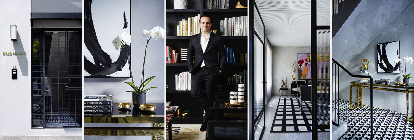
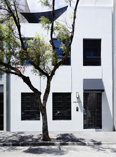
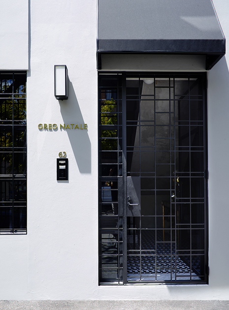
One glance at the exterior of this modernist building located in Sydney’s Surry Hills area and you will be quickly drawn to its clean outlook. It is especially alluring to everyone with even the slightest penchant for minimalism: indeed, from the outside, there is little that indicates this four-story building is the headquarters of famed Australian interior designer, Greg Natale, except for the discreet “Greg Natale” gold lettering against the pale grey façade.
Once inside, it is a different story. Whilst the exterior exudes an unassuming aura, the inside reveals a luxurious world where sophisticated glamour and exquisite craftsmanship intertwine. Before going through any details, it is important to note that unlike on other projects where Greg Natale Design — established in 2001 and works predominantly in high end residential — has acted at the very least as interior architect and interior designer, this time there is a notable role shift to being the client as well. “The process of being a client is a tricky one when you are a designer,” says Greg. “In designing this office, the space had to not only reflect my tastes and my aesthetic, it had to be a functional, practical building, as well as speak to many people. My clients had to emotionally buy into the space when they arrived. It was a showcase in many ways, a chance for us to demonstrate our capabilities and our aesthetic.”
Indeed, in creating this new office and showroom space, Greg set about designing a space that celebrated the sense of relaxed luxury. Inspired by the Manhattan townhouse owned by the late American fashion designer, Halston, which was designed by architect Paul Rudolph, this headquarters expresses Greg’s love for a neutral palette of black, white, and grey. As with his other projects which start with this structural base, from there, Greg adds touches of warmth, tone, and texture, with accents including rugs, cushions, and art. Meanwhile, the open planning and use of glass partitions underscores the fact that this is a converted semi-industrial building into something elegant.
“In designing this office, the space had to not only reflect my tastes and my aesthetics, it had to be a functional, practical building, as well as speak to many people.”
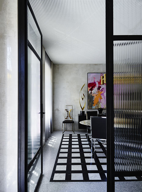
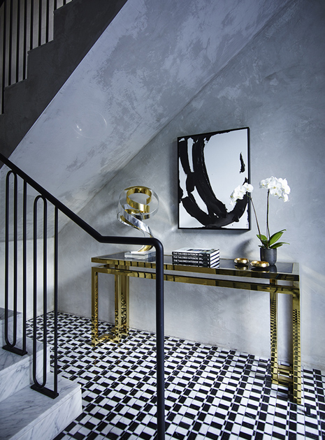
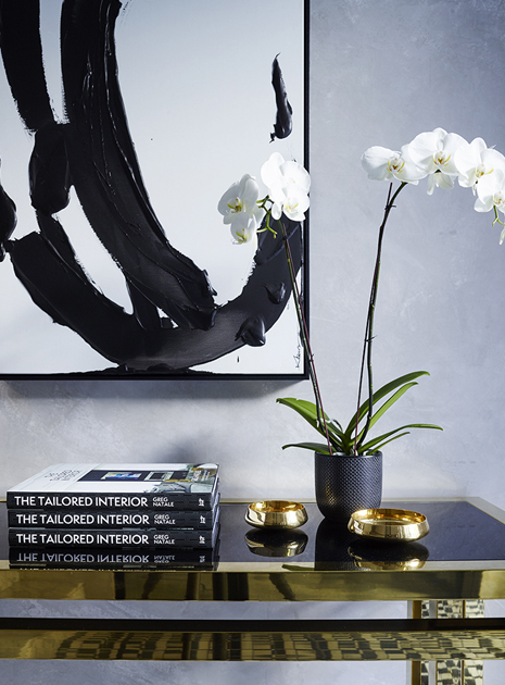
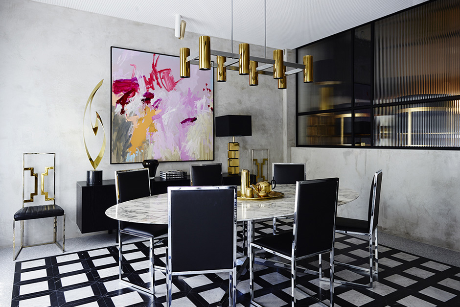
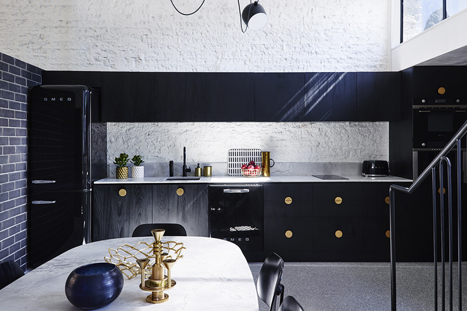
The moment you pass through the exterior and into the entrance, there is an immediate feeling of satisfaction upon seeing the luxurious finishes, high-end furniture, and layers of detail. Greg Natale’s own Sottsass black and white geometric marble are enhanced by an organic Kerry Armstrong painting and a sleek gold console table that features a striking metal sculpture by Los Angeles artist, Dan Murphy. Moving on to the boardroom, there is a large oval Florence Knoll marble table surrounded by vintage chairs and situated underneath a brass pendant light – which serves as the ideal space clients and designer alike to exchange ideas. To further add a glamorous feel to this space, Greg brings in bold splashes of pink and orange in a painting by Jo Davenport. “To really be a Greg Natale project, it had to have the glamorous layer, so we used pops of brass and metals against the expanses of terrazzo stone floors and the abundance of marble,” says Greg. “All balustrades, metal work, partitions, and joinery were custom designed – a tailored approach to the space and our needs that reflected our practical approach to all our works.”
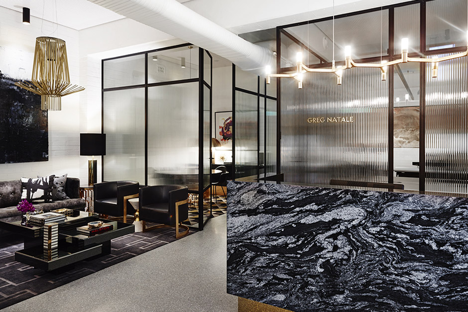
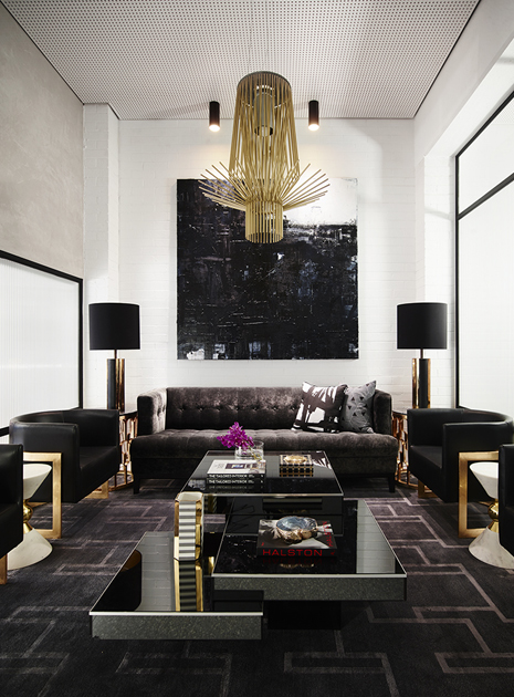
Staying true to his formula of starting with a black, white, and grey palette; when continuing the journey upstairs, you will ascend a grey Carrara marble staircase framed with a black steel balustrade towards the main reception, which features a black marble desk, brass vintage lighting and a specially commissioned wall relief sculpture by Dion Horstmans. The reception area itself is decorated with a charcoal sofa from the designer’s Chest range and tub chairs from his collection for World’s Away set atop a customised Greg Natale hand knot rug.
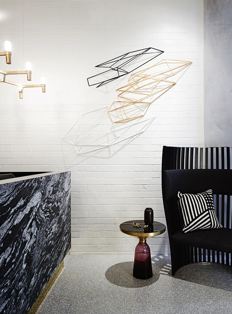
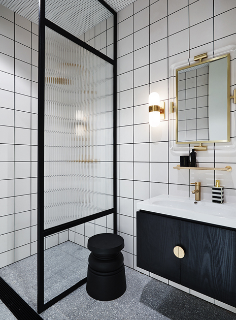
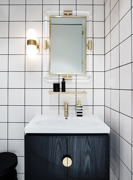
The divided spaces that unfold behind the reception seem to flow seamlessly from one to another: from the house offices, bathroom, client meeting room, all the way up to the spacious showroom where Greg displays his range of interior products. Flos pendant light, Eames chairs, framed work on paper by artist Graham Kuo; all of those elements fit nicely with the overall minimalist palette, accentuated by bold strokes of purple, watermelon, and gold.
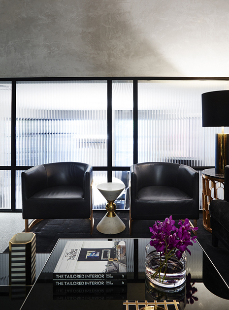
“To really be a Greg Natale project, it had to have the glamorous layer, so we used pops of brass and metals against the expanses of terrazzo stone floors and the abundance of marble,”
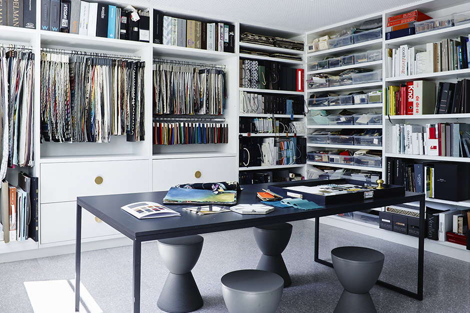
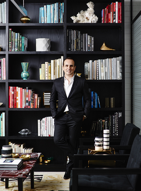
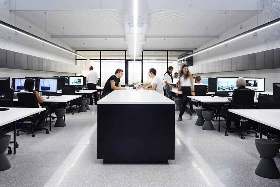
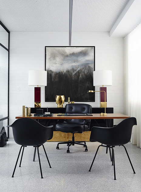
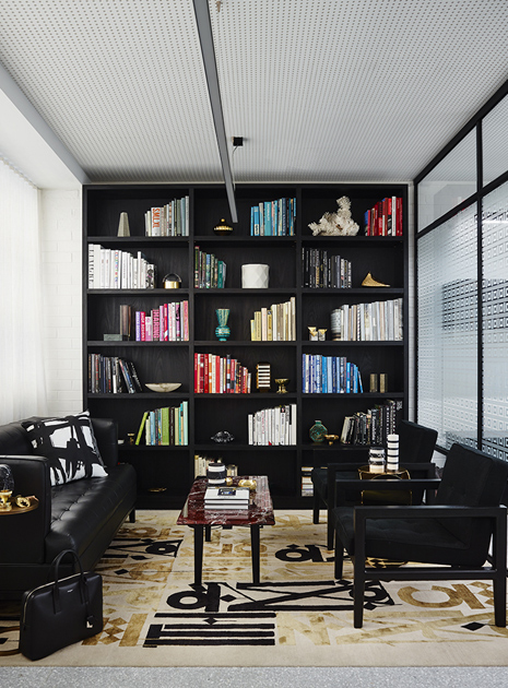
Coming up to the third and fourth floors, it is as if you get a glimpse into the designer’s main inspirations: numerous swathes of fabrics, sample tiles, and finishes line the shelves. Not to forget the staff room with a playful injection of Andy Warhol’s Campbell’s Soup Can prints, rooftop terrace, private office, and a large open floor plan design studio with 16 work stations for the growing team. As for Greg’s private office, it features a library area – with beautifully stacked books that is already a sight to behold, if only for the colour organization – complete with lounges, a red marble coffee table, and a painting by artist Scott Petrie, framed by lamps from James Said Collections, Perth.
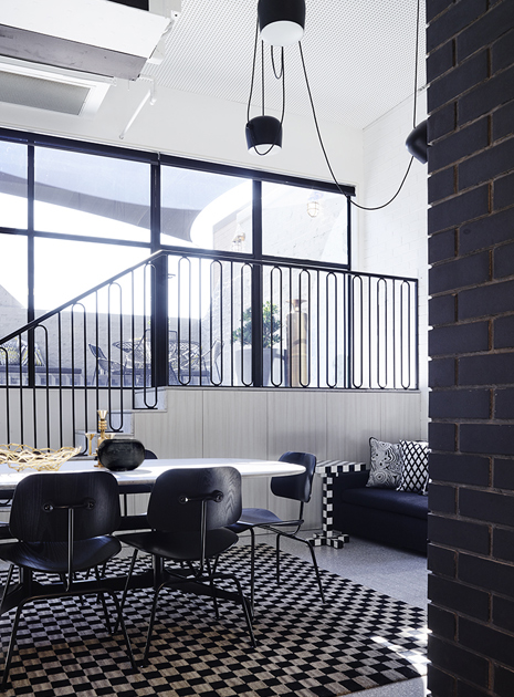
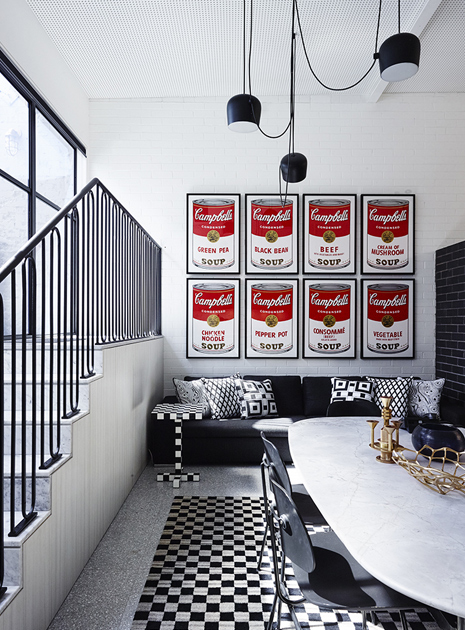
With so many minimalist yet luxurious areas in this building, one might wonder, which is actually his favourite? “I guess if I had to pick one spot, it would be the waiting area and reception. I love the scale in this space, the perforated ceiling boards, the artworks, and the mix of vintage furniture with my own designs. It’s a very chic space, and I’ve been told it reminds people of a luxury boutique hotel. I think that’s a nice assessment,” concludes Greg.
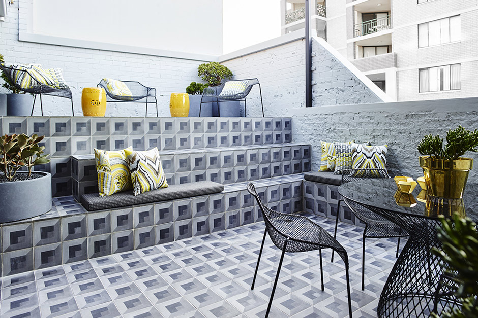 CUBO Tile by Greg Natale


