A Bold Manhattan-Inspired Residence
Text by Janto Wihardja & Anggita Saraswati, Photography by Derek Swalwell.
Saturday 31 October 2015
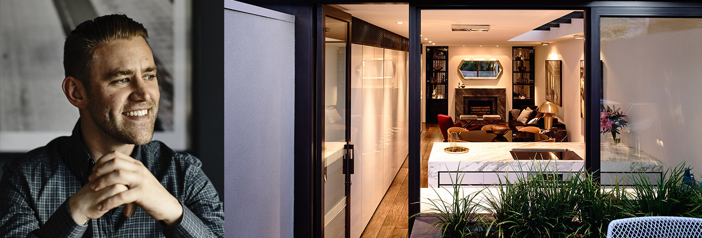
Known for its high-end residential, retail, and hospitality work in Melbourne, London, Sydney and abroad, Travis Walton Architecture has completed more than 50 projects to date – all with a Design Director who is only 33 years old. Its latest project is nothing short of amazing: the transformation of a single-fronted Victorian heritage home that was once a charming, 80-year-old white brick house in Melbourne, Australia, into a bold Manhattan-inspired residence. With thoughtful attention to details that give a nod to the home’s heritage while ensuring modern comfort for today’s fast-paced world, lead architect Travis Walton has struck the artful balance between the classic and the contemporary when designing the Leopold St residence in Melbourne’s South Yarra. Sleek materials mixed with thoughtful textures create a sophisticated interior that feels urban but never harsh: matte black metal sits alongside natural Calcutta and Grigio Cenere marble; natural stone works with Mikasa Ebony timber veneer; vibrant textile hues pair back to natural finishes such as European Oak timber flooring and brass details.
An interview with architect Travis Walton.
Describe the biggest challenges on this Leopold St project?
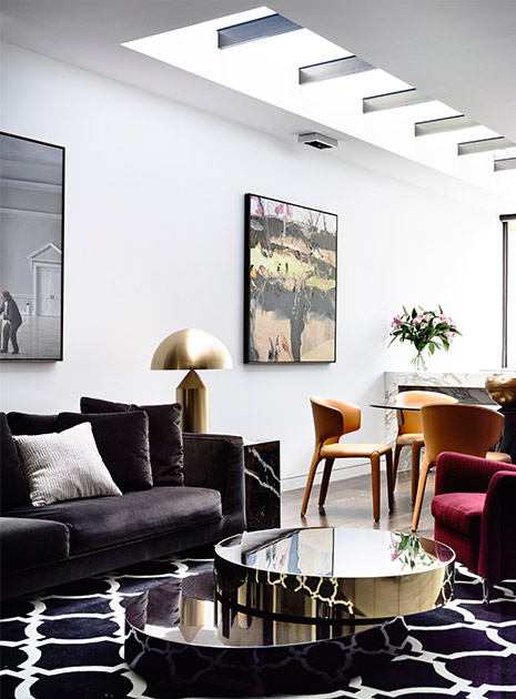
The biggest challenge was how to bring natural light into the new residence given that we were built between two boundary party walls. Our solution was to step back the second floor and install a continuous glazed roof between the forms resulting in a gallery art wall on the ground floor space.
In your opinion, what is the most interesting about the interior of the house?
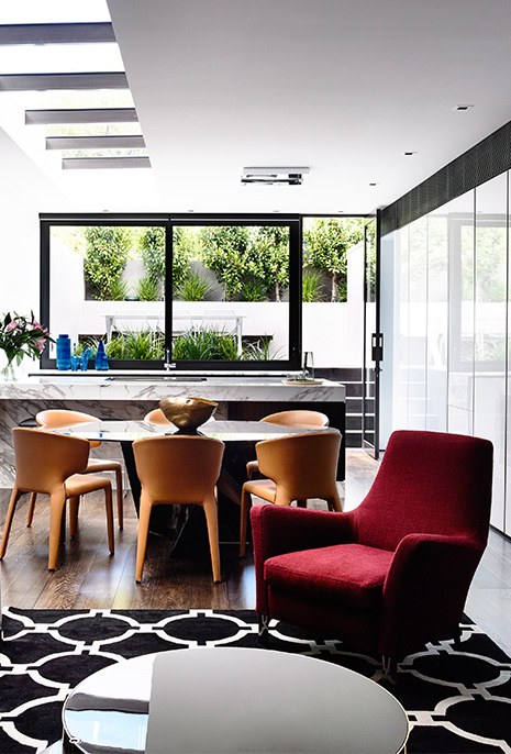
I love how the courtyard paving runs in line with the kitchen benchtop creating a great connection to the outdoor landscape.
The overall nuances look bright and airy due to abundance of natural lights. Please share with us your opinion on this.
This is very true – the natural light aspect of the brief was our imperative. By having multiple sources of reflected natural light internally, both on the first floor and the ground floor, we were able to create a greater sense of space. Historic homes such as this are so often typified with long dark corridors and lack of natural light so it is a great outcome to achieve the complete opposite.
How different this Leopold St project from your previous projects?
Due to the property being built boundary to boundary on two sides, the challenge was to fill the long narrow space with abundant natural light. By stepping back the second floor from the south boundary we were able to create a 6 metre long continuous skylight. Not only does this offer excellent light to a wall of artworks but is also a great design feature.
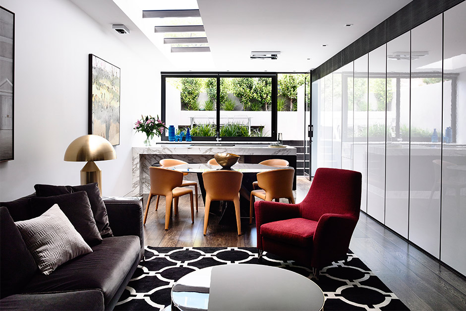
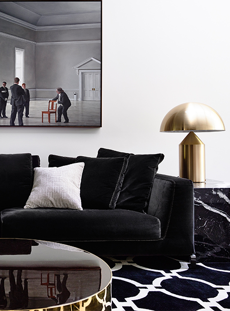
I simply love your selection and coordination’s of the furniture. Very bold and yet very elegantly modern. For example in the living room you combine B&B Italia sofa with Minotti Chair and Minotti coffee table. What one must do to make the living room could look more impressive?
Don’t be afraid to introduce more diversity to the space through the use of different textiles and combination of finishes which will create atmosphere and personalize your space.
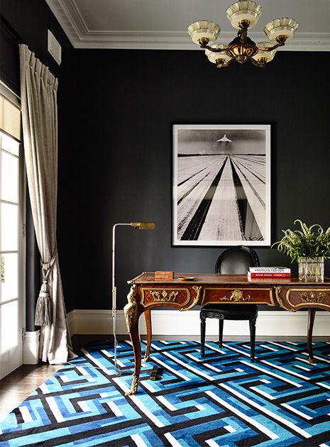
Tell me about the dark painting on the study room.
It’s a classic photograph of a concord in take-off. The client works in aviation so we wanted to personalize his home-office space.
Which part of the house is your favorite one?
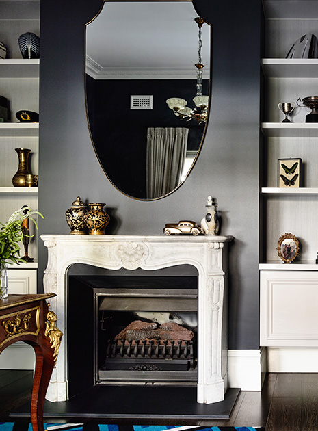
I’m particularly drawn to the living room which emulates the client’s brief and our key objectives. The living and dining spaces are a perfect harmony of classic and contemporary; traditional elements such as the commanding bespoke marble fireplace rivaled with strong masculine lines in the architecture are softened by curved furnishings and layered decorative pieces throughout.
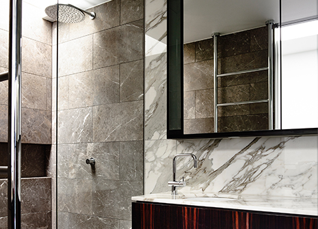
Tell me more about the bathroom design.
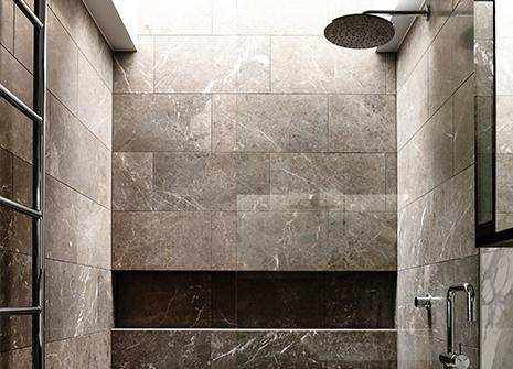
The bathroom also engages the notion of contrast between dark and light. The solid and somber feel of the marble is accentuated by the natural light washing the walls from the skylight above, activating the gentle textures of the material. The shower becomes the focal point of the space, taking on a spatial quality of a gallery, transcending its program of merely a place for cleansing.
Describe the design idea of the back yard section.
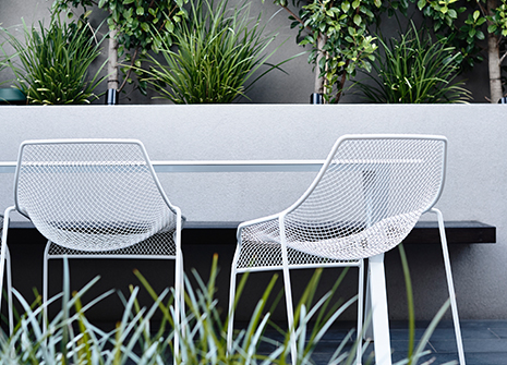
As light was an integral to the brief, engineering played a large role in allowing us to open up the ceiling throughout the living space and the full expanse of the rear elevation of the ground floor to integrate a north west facing private courtyard space.
Why does the façade look so contrast with the interior of the house.
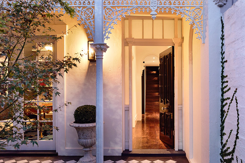
The building is in a sensitive heritage area within Melbourne so there is a requirement to maintain the existing Victorian terrace interface with the street and its context. This however was seen as an opportunity within the design to create a sense of excitement and contrast when entering the home. There is a moment of surprise as you step through the threshold and are immersed in a contemporary, clean and light filled space as opposed to expected dark period ambiance. The theme of light and clean spaces draws you through the home creating a sense of discovery the further you move throughout the space with skylights punctuating several rooms drawing in natural light and connecting the interior to the outside.
Basic Information
Land area : 139 m2
Location : South Yarra, Victoria, Australia
Architecture: Travis Walton Architecture
Interior : Travis Walton Architecture


